
Gardens of Golden Gate Park
A responsive website for the Gardens of Golden Gate Park in San Francisco, California.

PROJECT OVERVIEW
Timeline: Aug-Sept 2022
Role: UX/UI Designer
Background
Gardens of Golden Gate Park is a public/private partnership between the San Francisco Recreation & Park Department and the San Francisco Botanical Garden Society (SFBGS) to jointly operate the Conservatory of Flowers, Japanese Tea Garden, and San Francisco Botanical Garden.
“Our vision is that the Gardens of Golden Gate Park will become a leading cultural and conservation institution over the next decade with new partnerships, master plan, interpretive plan, museum accreditation, enhanced visitor experience, and robust community engagement,”
— Stephanie Linder, San Francisco Botanical Garden Society Executive Director
Objective
The Conservatory of Flowers, Japanese Tea Garden, and San Francisco Botanical Garden officially merged July 1, 2022, as the Gardens of Golden Gate Park (“GGGP”). This new entity needs a new overarching website that brings the three existing sites together.
Goal: develop and support in launching a new umbrella website for the Gardens of Golden Gate Park with a brand identity and story that embodies the history, present, and long-term future of the GGGP, the three unique garden sites respectively, and advances the mission of the partnership. Current thinking is for COF, JTG, and SFBG to retain their current, historic, well-established names but also be rebranded in coordination with GGGP when needed to represent as an individual site.
MARKET RESEARCH
Competitor Analysis:
Looking at different public garden websites, noting which features they chose to showcase on their landing page.
Market Analysis: Key insights on landing pages for public gardens and botanical gardens
I evaluated 18 different landing pages for botanical and/or public gardens in the United States and from large, well-known botanical gardens around the world. Landing page elements were evaluated for their ease of access - meaning, elements must be easy to view and find. Users should not have to dig for what they are looking for via the footer, site map, or search bar.
Of all the elements I evaluated, 83% of websites prioritized ticketing as either a button or menu item. This is a main call-to-action, since users would most likely visit a garden website to view ticketing information. However, I also found that 89% of websites also prioritized donations, events, and research and learning. These components make up a large part of public garden operations, as many are non-profit organizations and are centers for scientific research and public education.
Only one website (Royal Botanical Garden) displayed garden statistics on its main page, with species and conservation information. Only 11-16% of websites had accessibility information, neighborhood tips, healthy and safety information, or a diversity statement readily available. This information may have been nested within other menu items, but if a user was on the website to specifically look at this information, it would not be easily found.
Other important landing page elements that over 60% of websites included were: tips on planning a visit (this included ticketing information, prices, discounts, parking, and/or directions), information on their plant species or plant exhibitions, a section that featured their latest news or blog posts, and a call to sign up for their newsletter.
Notes on user interface: Websites that incorporated a dropdown menu when hovering over the menu items made it much easier to find what I was looking for as a user. This played a large part in my competitor analysis when evaluating landing pages for specific components.
USER RESEARCH
I was able to interview a mixed group of individuals, from people who don’t usually frequent botanical gardens, to avid museum-goers, to people who are current staff members at GGGP. Overall, I found that people generally expect to see ticketing information on the main landing page, and consider items such as exhibit information and visiting hours to be one of the most important elements. Some users were also members of local attractions and museums, so their familiarity with their respective attractions gave me a different perspective on what users were looking for. I was also able to obtain a unique perspective from staff members who regularly interact with visitors, both local and tourists, which allowed me to gain further insight on how the website is used by all groups of people.
Interview questions included topics such as:
How do you usually purchase tickets for an attraction or museum? What was that experience like?
Have you visited any museums or attractions’ websites recently? Which ones?
In a typical hour at work, what percentage of out-of-town vs. local visitors do you have coming in through the Main Gate?
How do you personally feel about our current website? What would you improve about it?
EMPATHIZE & DEFINE
User Personas
Empathy Maps & User Flows: Understanding All Needs
Based on the user personas above, I created two empathy maps for the two main tasks that would fit with our three personas’ needs:
1. Viewing ticket prices and purchasing a ticket - this would fulfill all users’ needs, since all would need to know Garden entry prices. This would especially meet the Tourist’s needs, since they are likely to purchase a ticket if visiting.
2. Viewing current events and purchasing an event ticket - this especially fulfills the Local’s goal of supporting the Garden and community by attending an event and the Decision Maker’s goal of planning activities for a group.
Flow 1: Viewing admission ticket prices and potentially making a ticket purchase
Patrons tend to purchase admission tickets at the door, but many still visit the website to view ticket prices and see if the Gardens offer any special discounts or tiered pricing. This information should be able to be accessed from both the landing page and a main CTA button. The organization currently utilizes a third-party sales platform, so if patrons choose to purchase a ticket online, they will be led to the platform’s website after clicking “Purchase ticket.”
Flow 2: Purchasing a ticket for an event happening at the Gardens
Patrons should also be able to view current events on the landing page. After viewing event details, such as the program description, the event time and date, and the participant fee, users can choose to RSVP or purchase tickets. This will, again, lead to a sales ticketing page that the organization uses.
INFORMATION ARCHITECTURE
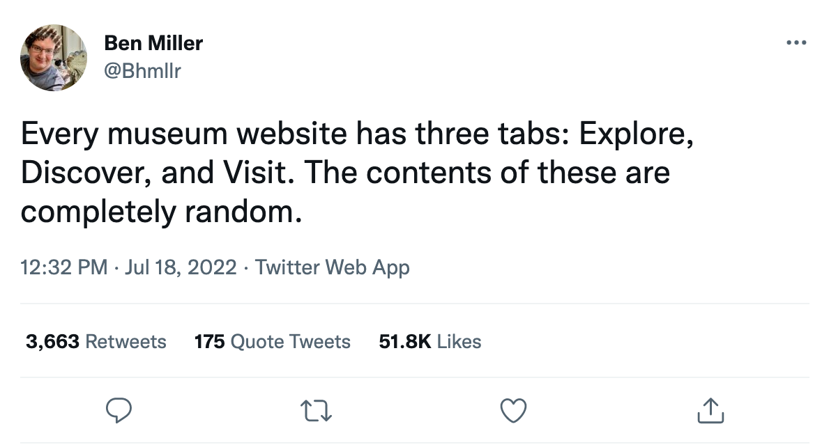
This Tweet summarizes a large (and mildly comical) problem that users encounter when visiting any website for a museum or public garden. From academia to visitor services, this is an issue we face all the time, whether we’re aware of it or not - let’s try to avoid that!
Card Sort
I asked users to sort cards into the six following categories commonly seen on public garden websites: Programs & Events, Learning & Research, Visit (or “Plan Your Visit”), About, Support, and “Other” (anything that didn’t fit into the other categories). I found that over 50% of users agreed on the bolded cards, while under 50% of users agreed on the unbolded cards underneath. Slightly surprising instances included users agreeing that “Address” and “Hours” belonged under the About header and not the Visit header, but I could empathize with users thinking that these two informational words would be found in a section about the Gardens. Overall, and in general, I agreed with users - these results seem intuitive to the majority of the group and can also be reflected in many public garden websites.
I used my card sort results, as well as the existing San Francisco Botanical Garden and Conservatory of Flowers sitemaps, to inform and create the new GGGP sitemap:
IDEATION
UI Style Guide
Our three existing websites all incorporated at least one shade of green and one other color, with sans-serif fonts. SFBG showcased a significantly longer landing page, with ticketing information and featured events, while JTG featured a relatively short and concise webpage that redirected users to the main Rec & Park ticketing page. All three sites utilize different ticketing platforms, and thus, different ticketing webpages.
Out of all the font types I looked at, I felt that Caudex most matched GGGP’s message. Although GGGP is a brand new entity, there is significant history behind all three sites. I wanted my main font to incorporate both a serif typeface and a modern feel. I chose to use Manrope for the body font, with 2% spacing to enhance readability. I wanted to use a sans-serif font with a high x-height and although other fonts met this criteria, some felt too round and futuristic and others were not suitable for a website that will incorporate relatively large amounts of text.
I chose to feature a deep, dark green as GGGP’s primary color, with pops of purple and light green to balance out that darker color. Purple seemed like the best fit for the secondary color, since it is a neutral color that can be associated with adventure, exploration, and creativity.
I chose to draw the logo myself, which features three different icons to represent the three different sites: a Victorian water lily flower for the Conservatory of Flowers, the iconic pagoda located with the Japanese Tea Garden, and a Magnolia tree for San Francisco Botanical Garden.
First & Second Iterations
After two iterations and two rounds of peer reviews, I decided to make these changes for the third iteration:
Increase the spacing between sections to give the eye a break - since this webpage is photography and image-heavy, I needed to provide adequate amounts of white space.
Change the section that features our three gardens - text was difficult to read and the three photo overlays made the landing page too busy
Add hover animations to the “Discover More” section. This section should tell users what to expect when clicking on it, or give users a choice of which webpage they’d like to navigate to
Change the spacing of the navigation menu to create balance
USER TESTING
Flow 1: Learn more about the Conservatory of Flowers and potentially purchase tickets
Flow 2: Learn more about Books On The Garden, an event happening at the Garden, and potentially RSVP for the event
Key Takeaways
FINAL DESIGN
CONCLUSION
What I Learned
Branding is key
After looking into and analyzing botanical garden and museum websites, both for this research and for an unrelated, non-UX work project, I noticed that many of them employed a very modern, minimalistic approach and aesthetic. It looked very clean and visually appealing, but I found that this aesthetic didn’t really fit their message. This approach also made it hard to find the information that I was in search of due to its minimalism. My user research also gave me some insight on this - one participant mentioned that she found that many botanical garden websites’ internet presence didn’t fit with their on-site message or the organization’s mission, and that there seemed to be a disconnect. Users also found that websites with flashy videos in the hero section and animated components seemed to take away from a botanical garden’s main message. From learning this, I strove to keep GGGP’s design both neat and informative, with its visual components reflecting the Garden’s deep history within San Francisco.
Next Steps
I was asked if my finished design could be shown to whoever GGGP chooses to work with on the rebranding project as an example, as this may inform future rebranding decisions. The following steps would be to take a look at each three Garden locations and figure out what the website should incorporate from each - this includes things like tour schedules for the three locations, volunteer postings, programs and events, bookstore and library happenings, and incorporating an improved and more streamlined flow to purchasing tickets. These topics are something that GGGP staff have been working to figure out, as the merger is only a few months old, but after determining the logistics of combining everything from three locations that have been operating as separate entities for years now, the website would ideally incorporate and showcase this.