
Case Study: Zeit
A responsive website for booking trips to the past.
Project Overview
Timeline: May - June 2022
Role: UX/UI Designer
Background
After years of discussion and deliberation, officials in Brussels announced the International Concordance on Time Travel, giving Zeit a set of standards to under which they can democratize the experience of time travel.
A total of 289 destinations all over the world, up from prehistoric times through today, have been approved and finalized to receive people any moment. Due to the need of control, destinations are only in the past. People will travel to controlled and extremely protected places. They are similar to what we know today as resorts, albeit with organized (and secured) trips to nearby cities and attractions, where interaction with locals will be limited. However, the travelers will be able to look at, and do things typical of the time, like workshop activities or attending shows.
Client
Zeit is a subsidiary of Richard Branson’s Virgin empire, and Virgin has been able to make time travel tourism available to all. Zeit is time travel to the past - for now. The brand should be:
Modern and fresh
Classical and historical
Objective
Zeit would like to create a new brand and set up an e-commerce responsive website in which they can sell travel packages to different times. Zeit would like to come up with the best way to display the trips, what’s special about each time and space, and how to classify or categorize trips to make it easier for people to find the one that they like best.
Market Research
Competitor Analysis
Market Analysis
Key insights on travel websites:
Travel packages often include a specific unique experience or relaxing destination.
Travel websites often have many accommodations, including lodging, flights/cars, and activities.
Trip packages often span from two to fourteen days, and itineraries range from self-led travel to strict timelines.
Overall, many booking websites meet a wide range of user needs and most sites offer multiple features. Some landing pages can look cluttered, depending on how accommodations are presented, but offer everything that a user would need to book their trip, get to their destination, and enjoy their stay.
User Research: Key Takeaways
Motivations
Traveling is appealing when users have the time and budget to do so
Users are willing to spend money on a trip if it means they will have a good experience
Time travel is risky, but users would be interested if all safety aspects were considered and history would not be altered
Needs
Users want to be able to book trips seamlessly, and to know exactly what they are paying for
Users prefer a streamlined checkout process, without the risk of tickets selling out before they are able to purchase
Users prefer some level of trip flexibility, due to busy schedules and a difference in interests
Frustrations
Purchasing and checkout processes can be frustrating if tickets sell out quickly or entering information is repetitive
Travel pages can be overwhelming if users are not familiar with the website
Users rarely purchase full travel packages due to inflexible schedules and personal preference
Goals
Users would like to book flexible trips with ease - spending money on necessities and being sure of what they're paying for
Users would like be able to view a variety of trips to suit all interests
Downtime is important for users when on vacation, and they enjoy scenic locations with a variety of activities
Overall
Users need a clear, comprehensive booking website that will allow them to view different types of destinations suited for different interests, budgets, and timelines. This booking and checkout process needs to be streamlined, and users need absolute clarity on what they are purchasing. Time travel presents some hesitance, so this product must be 100% transparent regarding travel details and itineries.
Empathize & Define
Persona
Empathy map
Users need a website that will allow them to not only complete the booking and checkout process seamlessly, they also need to be able to view destinations and itineraries clearly, view Zeit’s transparent policies and travel methods, and be able to create an account and sign in to view their bookings and potential written reviews. Clear, concise filters are necessary for user who know exactly where they would like to go and what their trip requirements are.
Ideate
Low-Fidelity Wireframes
UI Style Kit
Zeit needed to be modern and fresh, while also being classical and historical. I chose to use a combination of fonts - a timeless serif font and a more modern, simple sans serif font for easier readability. I chose to use a darker, navy background to give Zeit an aesthetically minimal feel, and used a golden yellow as my contrasting color. I didn’t want my text to contrast too much and wanted to give Zeit a more classical look, so I chose a very light, slightly warm-toned cream color for my text. Lastly, to add another layer to my components, I chose a lighter version of my navy background to contrast the yellow and use as a tertiary color.
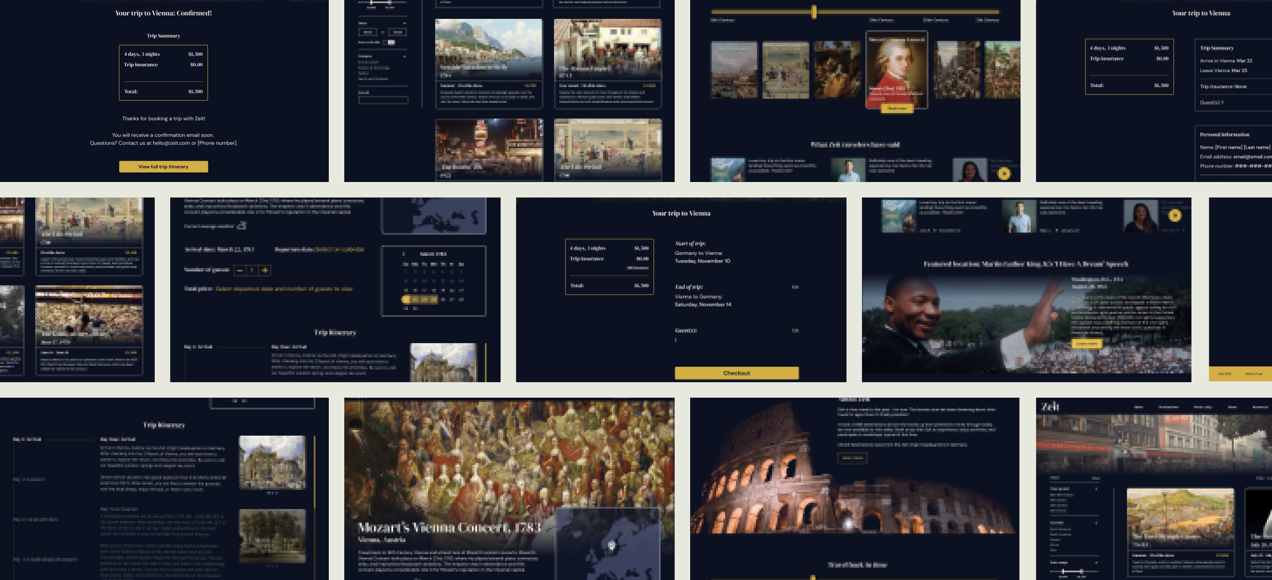
High-Fidelity Wireframes
User Testing & Iterations
User Testing: Key Takeaways
Major Iterations
Final Design - full Figma file


Conclusion
What I Learned
Narrow down my user research questions
Since this was my first UX design project and my first time going through the UX process, my user research interview questions were a bit broad. The end product was also a fictional concept, which made it more abstract and harder to pin down the problems that I wanted to answer with this project. I’ve learned that it’s helpful to have a few solid problems and questions that I wanted to answer before moving forward.
Keep track of iterations
I have gotten pretty familiar with Figma on a functional level, but this was my first time completing a project from start to finish. I had gotten used to working in the same file for previous projects, but did not keep in mind that it is important to show drafts and previous work. I was editing and making changes to the same file, which allowed me to make small changes and tweaks every day, since I like to look at designs with a fresh eye. However, this resulted me not having anything to show for the very first version of my high-fidelity wireframes. Luckily, Figma allows users to view previous designs by showing version histories (thank goodness!).
Small pieces complete the puzzle
Initially, this project was overwhelming. In addition to creating a responsive travel site, the product had to also incorporate time travel, the possibility of which has been debated over time and time again. It was easy to get sucked into overthinking the time travel aspect of this project, as well as thinking about what the overall product would look like in the end, but I have learned to take things one step at a time. From completing my user research to creating deliverables such as a persona and a site map, I now know that each step has a purpose and plays a major role in what the end product will be.
Next Steps
The next step to bring this product to fruition would be to test other Zeit destinations, instead of asking users to find a specific destination to book. The high-fidelity wireframes would have to be expanded to fit all destinations for users to consider, and due to each destination having unique features, price points, and, most importantly, dates, this would give Zeit a more dynamic testing experience. More information on time travel would also have to be given to users, designers, and developers, so everyone is on the same page and all safety aspects would have to be considered and made clear to potential travelers.